How to Choose fabric colors for a quilt project
In this video, I take you behind the scenes of my fabric and color selection process for a new quilt design. Whether you're a beginner or a seasoned quilter, you'll learn valuable tips on how to choose fabrics, test your color palette, and ensure you achieve the perfect contrast and harmony in your quilts. I walk you through the entire process, starting with a digital mock-up and progressing to working with real fabric swatches. You'll see how I use color theory and value contrast to make the most of each fabric choice, and how tools like color cards can enhance your decision-making.
By watching, you'll gain insight into how to refine your quilt designs, experiment with different color combinations, and troubleshoot any issues that arise during the selection process. Plus, I'll show you how to make sure your final quilt comes out exactly as you envision it, with all the right balance and flow.
VIDEO TRANSCRIPT:
I wanted to share with you all my process of how I select fabrics and colors for my quilt designs. I'm at the beginning of a new pattern project, and I thought this would be a good opportunity to walk you through how I go about picking fabrics.
00:30
I like to start with a neutral surface, and I'm actually sitting next to a window and it's sunny out, so I have a lot of good daylight coming in. You want good light when you're doing this. I start with a digital mock-up.

00:46
The nice thing about that is then I can test actual fabric colors. I colored my design in PreQuilt using Ruby and Bee Solids. And after I do that, I always like to validate my fabric choices with actual fabric.
01:09
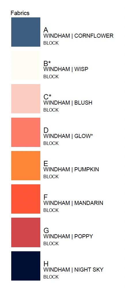
The nice thing is I have this swatch set. This gives me the chance to kind of test my selections. My digital mock-up uses Cornflower as the background fabric. and then a series of colors. So we have Wisp, Blush, Glow. I love this color. Then I threw in Pumpkin just for a transition color to add something a little bit different. Mandarin, Poppy, and then Night Sky.
01:50
So what I'm going for with this design obviously is kind of an ombre effect starting with very light and a very dark. And so obviously I want my background to be a mid value so that it offers good contrast with both of these colors because these colors will be the ones that are situated next to the background in all instances within this design.
02:18
So now that I've laid these out, I like this color palette, but the next step that I do is I take a photograph of it and I grayscale it. Looking at the grayscale photo, you can see that there's not a lot of value contrast between these three colors here. I might actually test out additional colors.
Maybe I'll swap in Delphinium, see how it's slightly lighter. That looks nice with this glow as well, but I might go slightly darker here too. Let me try Claret instead of Poppy. And again, I'll take a photo and make it grayscale.
03:23
That's better. I have better contrast and value between these two, but now these three kind of seem to be in the same value range. So I might just play here. Maybe I'll take away Pumpkin and move Delphinium here and maybe bring back Poppy. Let's take a grayscale photo of that and see what it looks like. That's pretty good.
04:03
The interesting thing is now that I'm looking at these, the queen size of this pattern calls for seven colors here. But I'm actually only going to make the full size, so I only need six colors here and a background. I'm actually going to take this color out because I won't need it in the quilt that I'm going to be making.
04:32
Originally designed this, I noticed that Cornflower and Pumpkin kind of. That was my mid range over here. Those are complementary colors. Complementary colors also offer a great deal of contrast. They kind of bring out the best of each other. I have this deck of essential color cards. These are really handy. I like to use these when I'm actually doing this, selecting colors. I kind of take this as an opportunity to really practice color theory. For me, it's better to learn as I do.
05:20
I pulled the card that most closely matches this hue. This is a little bit darker, but it is the same hue and that's if you can see that it's a blue. And you can see that the complementary color is this orange-yellow, which when I pulled that card, orange-yellow, it's this. Those are complementary colors.
05:57
The thing of it is, now my color palette has kind of changed and I'm no longer using Pumpkin. Because I am making this for myself, I'm making a full size to use in my bedroom. My bedroom, this is too dark. I wouldn't want something that dark in my bedroom. So while I love the way it looks in the mock up, I don't quite like it in real life with the actual fabrics. I'm going to swap out this Cornflower for Pool. This just kind of speaks to serene bedroom vibes to me. I already like it already, but I want to just make sure that I still have good value contrast here. Just visually you can tell, but.
07:03
I'm not quite sure about Night Sky anymore, so I might swap that out. This is kind of a this is actually in the violet blue range, which might be hard to see on camera, but it does have a violety hue in there. It's not just a strict blue color. I might swap that out for something darker. I pulled Ink.
07:35
The interesting thing about Ink is that, again, it might not read on camera, but it does have a blue hue to it. When you look at, this is this is Midnight. This is a true black. And when you look at these next to each other, again, you might not be able to see it on camera. But when you look at them together, it's clear that this is blue and so I might swap that in as well.
08:07
This feels very nice and serene, but there's some drama over here too, which I really like. I'm a big fan of black and white, so let's take a black and white photo and see what it looks like. There's really good, a really good transition of values here. I have, you know, very good contrast of values between the background and these two edge pieces. I think I'm really happy with this.
08:43
I want to just again pull a card to see. This is matches that hue. Again, this is slightly darker, but it's the same hue and Pool is an aqua blue, which.
08:56
If you follow me, you know I'm kind of obsessed with. The complementary color is orange-red. So I pulled a few of those just to see what that looked like and that's Poppy and that's Blush.
09:22
It always surprises me when I pull fabrics and then I check it against the cards. I think our eyes are much smarter than we give them credit for. I think our eyes are just drawn to these types of relationships between colors. Or maybe it's just, I don't know, maybe that's just me wishful thinking that our eyes worked that way, but.
09:53

I'm really happy with this. These are the colors I'm going to go with. I hope you found this helpful. And if you did, let me know.